

Power BI dashboards for employee survey analysis in schools & MATs
In the education industry, employee surveys are crucial tools for evaluating performance and understanding staff needs. The most commonly used employee surveys include:
1.General annual employee survey
This comprehensive assessment tool gathers employee feedback on various aspects of their work experience, including job satisfaction, workplace culture, and organisational effectiveness.
2. Employee Net Promoter Score survey
‘eNPS’ is a powerful tool that helps organisations measure and improve employee satisfaction and engagement.
3. Employee sentiment analysis survey
The process of systematically evaluating and interpreting the attitudes, emotions, and opinions expressed by employees within an organisation.

Survey results can help in understanding the morale and satisfaction levels of teaching and non-teaching staff, identifying areas that schools need to improve, assessing the school environment for teaching and learning, also evaluating impacts of school polices. These surveys offer priceless information to school managers and heads of schools in helping them make better decisions and improve schools’ business performance.
However, traditional methods of analysing these surveys often fall short of providing actionable insights. This is where Power BI dashboards come into play, revolutionising the way educational institutions handle survey data.
In this blog, we will explore how Power BI transforms survey analysis across the 3 types of employee surveys, offering a more dynamic and insightful approach compared to conventional methods. First, let’s investigate why the traditional methods don’t cut it anymore…
Limitations of Traditional Survey Analysis
Almost all conventional surveys are in text format generating quantitative data that can be summarised in reports, and interpreted as polls, percentages and averages. This is a perfectly helpful and straightforward way to present survey results. However, these survey reports cannot provide deeper insights into the underlying data and therefore will not provide clear direction for actionable improvements.
Since their capabilities are limited at analysing surface-level data, they don’t reveal crucial insights like the root causes of an issue. Moreover, due to their limited capability to interpret raw data and act on large sets of collected information, they cannot explain the ‘Why’ behind a response or the key driving factors behind a trend in responses.
Power BI for survey analysis
Power BI is a powerful tool that goes beyond simple data visualisation. Unlike static reports, Power BI dashboards are user interactive; school administrators can filter results by schools, date, time, region, department, staff profile, survey question or topic.
Moreover, AI enabled tools within Power BI (Q&A, Key Influencers, Smart Narrative, Decomposition tree and newly released Copilot), allows educators to gain key information that resides below the surface level, identify important influencers, forecast trends, and ultimately make better decisions.
Looking to invest in Power BI? or just curious about the various visualisation tools available within Power BI? Check out our blog Evaluating AI visualisation tools in Power BI for a comprehensive breakdown of their features, benefits and limitations.
General Annual Employee Survey Analysis

Demographic Analysis
While analysing annual employee surveys, Power BI can be used to create a comprehensive and interactive visualisation of demographic data, such as age, gender, ethnicity, years of service, and job roles. These interactive visuals allow school administrators to filter and analyse responses based on various demographic groups. The results help school heads and business managers in identifying the specific needs and concerns of different demographic groups within the school, leading to more tailored and effective interventions.
For example, filtering the survey data by gender can reveal which group has a higher proportion of staff in teaching positions, and is likely to serve longer (employment length more than 10 years) or even if one group holds a lower percentage of staff in senior leadership positions.
Comparative Analysis
Power BI reports can provide comparisons between categories like 'School vs. Region'. This allows Heads of schools & Heads of MATs to benchmark their performance against other schools within the region, identifying where a particular school excels or lags.
You can also view and compare historical data, meaning you can track if there’s been any progress or further deterioration of a particular school. Findings of such comparative analysis can help to elevate the overall standards of education across the whole region.

Imagine a MAT sends out an annual employee survey to its schools that have the question ‘You have received recognition or praise for doing good work’. The results indicate School A has increased negative response this year compared to last year and School A’s negative response is higher than its region average.
The analysis will reveal which schools perform poorly in acknowledging their employees, if this is a pattern and what related actions are needed for improvement.
dATA DRILL DOWN
Power BI reports offer detailed insights into how employees responded to individual survey questions. Instead of merely presenting aggregated numbers, the dashboard allows users to drill down into a specific question to understand the distribution of responses.

It can rank each question based on various responses showing which questions have higher positive/negative responses than others helping identify strengths and problem areas.
For example, in the table below the most positive and negative responses across all questions are split by employee profiles and are highlighted like a heatmap. By applying matrix table and conditional formatting, the colour-highlighted responses provide straightforward feedback. It shows that Question 1 and Question 3 have the most positive responses from the Senior Leadership Team.
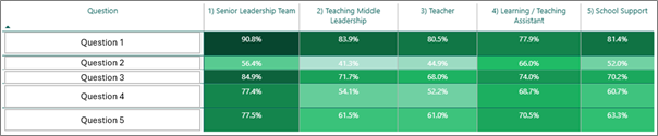
This feature goes beyond basic numerical data, providing a deeper understanding of each employee group’s feedback on each question. This helps school administrators understand which issues need to be acknowledged, prioritised for improvement (e.g. Question 2 ‘Teaching Middle Leadership’ and ‘Teacher’) and or escalated.
Do you already have Power BI dashboards in place but struggle to extract its full value? Check out our blog Enhancing Power BI report performance. Our visualisation consultants reveal the best data optimisation tips you can implement to maximise your insights.
KEY INFLUENCERS
One of the most powerful features of Power BI is its ability to analyse the key influencers behind specific topics/responses. By examining relationships between variables in a dataset, Power BI report can identify the most significant drivers behind trends or outcomes in datasets and rank the factors that matter the most/least. By identifying the key influencers, users can see how changes in one variable affect other variables.
For instance, when examining what influences respondents to "Agree Strongly" with a statement, the analysis reveals several key factors. Consider the chart below, which illustrates these findings:

The most influential factor is the respondent's position within the company.
This is followed by a positive response to the statement "I know the process/steps to report discrimination or harassment and would feel comfortable doing so if necessary”.
Other significant influences include being part of the male employees’ group and having less than one year of service with the company.
This analysis provides valuable insights into the characteristics and opinions that shape strong positive responses in the survey.
All the visuals are dynamic and can be combined with filters such as survey year, region, school and employee profile. Some predictive analytics can also be employed to forecast future trends based on historical data, enabling proactive decision-making.
Employee Sentiment Analysis

Power BI can analyse responses to understand the emotional tone behind employee feedback. This sentiment analysis reveals crucial insights into your school staff’s mood, happiness with work, concerns, and areas of satisfaction.
sENTIMENT SCORING & STATISTICS
The tool provides various visuals displaying detailed sentiment analysis statistics like overall average sentiment score, top emotions identified and more.

These metrics allow school administrators to quickly gauge the general mood of employees.
By breaking down the analysis into individual topics, the report can also offer more detailed information for each area:
Mean score
Total number of responses
Response labels
Associated comments
Topic ranking

Power BI dynamically bonds all related information together, providing a comprehensive view of employee sentiment across different aspects of their work experience. This detailed breakdown enables administrators to identify specific areas of strength or concern within a school/MAT.

Word Cloud Visualisation
This feature transforms text data into visually compelling representations, making it easier to spot trends and patterns at a glance. By leveraging custom visuals or external tools, Power BI users can create word clouds that highlight the most frequent words or phrases in their datasets.

But why are word clouds so useful? They offer a quick way to digest large amounts of textual information, uncovering insights that might otherwise remain hidden. It also enhances your report’s storytelling potential, allowing stakeholders to understand complex information more effectively.
Want to dive deeper into the art of presenting your data effectively? Check out our blog: 3 Key Elements To Get Data Storytelling Right to learn how to take your data storytelling to the next level.
Summarisation
Another useful insight tool of Power BI is it's smart narrative AI visual. Similar to the Copilot capability, by applying this feature, Power BI reports can automatically generate text-based summaries of visualisations and reports. It uses natural language processing to analyse the data and create informative narratives that highlight key insights.

In the example above, based on topics and their mean scores, the smart narrative summarises that across all 83 analysed topics, the topic ‘People mentioned by name’ has the highest topic mean score whilst the topic ‘School administration’ has the lowest score. This summary reveals which issues the employees are happy with and which aspects the staff are unsatisfied with, that need to be changed. The summary also shows that the negative responses accounted for 62.2% of the count of topic labels, which indicates that the school must review and improve on employee satisfaction.
As the AI capabilities in Power BI continue to evolve and transform data analysis, partnering with experts can ensure you maximise the potential of these powerful tools. Book a call with our data visualisation experts at Ei Square to guide your through the AI integration journey.
Employee NPS Survey Analysis

Employee NPS (eNPS) survey measures employees’ satisfaction with the organisation and the likelihood of recommending their workplace to others. The eNPS survey report is a valuable tool for HR and management to understand the sentiment of their workforce and make data-driven decisions to improve school staff satisfaction and retention.
Power BI dashboard offers an overall NPS score which is calculated as the percentage of promoters minus the percentage of detractors. The higher the score the better. Therefore, the goal is to maximise the number of promoters and minimise the number of detractors. This snapshot gives administrators an immediate sense of overall staff loyalty and satisfaction. Power BI can track NPS scores and response rate trends over time. This temporal analysis helps in understanding the impact of various factors on employee sentiment.
Hierarchical Analysis with Decomposition Tree
Power BI's AI insight tool 'Decomposition Tree' offers a hierarchical structure that identifies primary factors influencing specific metrics. This tool allows users to drill down into different levels of detail, uncovering underlying components of the data.

Consider the graph below as an example. It shows that the overall employee Net Promoter Score (NPS) of 35 was primarily contributed to by the June 2024 survey. Drilling deeper, we see that within this survey, the Hampshire & Yorkshire region contributed most significantly, particularly from the Senior leadership team.

This hierarchical breakdown traces the root factors that most affect the results, providing a clear understanding of where and why certain outcomes are displayed. By following these branches, users can quickly identify the most influential elements in their data, enabling more targeted analysis and decision-making.
Correlation Analysis
Power BI's analysis capabilities extend beyond simple survey reporting, offering insights into the key drivers behind Net Promoter Scores (NPS). By examining correlations between various factors - including survey response rates, employee profiles, and regional data - Power BI identifies and ranks the most significant influencers on NPS scores.

From the example above, our analysis reveals:
Employee profile impact: Senior leadership team membership is the strongest positive influences on NPS scores.
Regional variations: Employees in Hampshire tend to give higher NPS scores.
Response rate correlation: A 0.33 increase in response rate corresponds to an average 10.73-point increase in NPS.
The interactive nature of Power BI reports allows users to compare NPS and response rates across different dimensions: between regions, across schools, over different years & more.
This dynamic view highlights areas of significant change, particularly negative shifts, enabling targeted interventions and informed decision-making.
Whether you're dealing with parent feedback, staff surveys, or student assessments, our team of experts at EIS can help you uncover crucial insights you need to take action. We specialise in analysing education-specific data, creating custom reports for school administrators, and providing actionable recommendations to enhance school's operations. Let us transform your survey data into strategies that drive real improvements in your educational institution. Contact us today to learn how we can support your school's data needs and help you make the most of your surveys.
A final note
Employee surveys are crucial for educational institutions to assess policy effectiveness and understand their workforce. However, traditional surveys often fall short of providing actionable insights.
Power BI transforms this data into valuable, strategic information that can highlight key issues, identify key influencers and root causes, and measure progress. By leveraging these capabilities, school administrators can make more informed decisions, create a positive working environment, and ultimately improve educational outcomes.
The process doesn't end with implementation. Continuous monitoring through regular surveys and Power BI dashboards ensures that interventions are effective and achieve the desired impact. This cyclical approach of data collection, analysis, action, and monitoring creates a dynamic system for ongoing improvement in educational institutions. Power BI serves as a bridge between raw survey data and meaningful institutional change, enabling a data-driven approach to enhancing the educational workplace.