

Project managers have to keep up with a steady flow of information in their every day work life. Success depends on successfully comprehending and communicating this data, which ranges from project budgets and schedules to risk assessments and performance indicators. But let's be honest, rows and rows of numbers can be overwhelming and downright boring! This is where the power of data visualisation shines.
Imagine transforming dry spreadsheets into captivating charts, insightful graphs, and eye-catching infographics. Suddenly, complex information becomes digestible, trends become apparent, and key insights jump out at you. Making your data more comprehensible, interesting, and powerful is the goal of data visualisation, which goes beyond simply making your presentations seem nice.
In this blog post, we'll examine why data visualisation is an indispensable tool for every project manager. We'll explore how it improves communication, enhances decision-making, and ultimately drives better project outcomes. So, get ready to discover how to turn your data into a powerful storytelling medium and elevate your project communications to new heights!

1. Simplifying Complex Information
Imagine trying to explain a complex project to your grandmother. Would you bombard her with spreadsheets and technical jargon? Probably not. You'd likely use simple language, maybe even draw a diagram or two, to help her understand. Data visualisation does exactly that for everyone involved in a project.
Instead of drowning in a sea of numbers and technical terms, data visualisation transforms raw data into easily digestible visual formats. Think of it as translating a foreign language into your native tongue. Suddenly, the information becomes clear, concise, and relatable.
Gantt charts become visual timelines, showcasing the project's journey from start to finish. You can see at a glance which tasks are on track, which are delayed, and where potential roadblocks might lie.
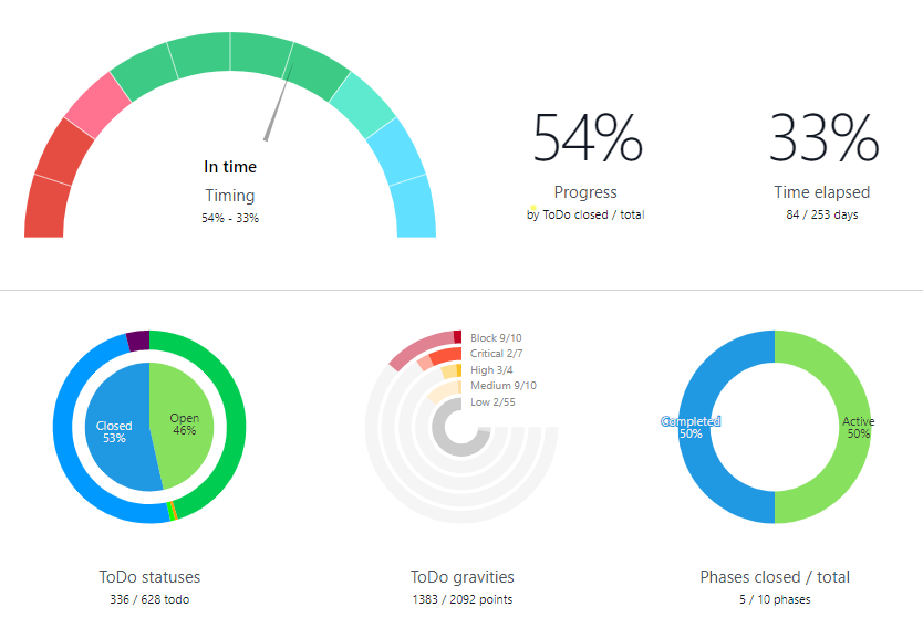
Pie charts effortlessly illustrate how your budget is being allocated, highlighting any areas that might be overspending or underutilised.
Bar charts provide a clear comparison of different project metrics, such as team performance, resource utilization, or risk levels.
We can use our natural capacity to comprehend and evaluate visual clues when information is presented graphically. It's like having a conversation with pictures, making it easier for everyone – from project managers to team members to stakeholders – to grasp the key takeaways.
This clarity fosters better communication, reduces misunderstandings, and ensures everyone is on the same page. No more misinterpretations or frustrating back-and-forth discussions trying to decipher complex spreadsheets. Data visualisation empowers everyone to understand the project's progress, identify potential issues, and make informed decisions.
Want to learn more about effectively managing stakeholders in your projects? Check out our other blog post, "Practical Tips for Managing Stakeholder Expectations in Project Delivery," where we delve into strategies for aligning stakeholder expectations with project goals, building strong relationships, and ensuring everyone is on the same page throughout the project lifecycle.
Surprisingly, data visualisation can even spark unexpected discoveries. By looking at your data from different angles – a pie chart here, a bar graph there – you might spot patterns you never noticed before. Maybe you'll see an unexpected trend, or gain a deeper understanding of how different parts of the project interact. It's like suddenly being able to see the inner workings of the project, like putting on a pair of X-ray glasses.
It is more important than ever to communicate effectively in the fast-paced, data-driven world of today. Data visualisation is a necessary tool for any successful project, not just a nice-to-have. You can increase project clarity, foster teamwork, and eventually produce superior project results by utilising the power of visual communication.

2. Enhancing Decision-Making
Imagine trying to make a crucial decision based solely on a mountain of spreadsheets. It's like trying to find your way through a dense fog – you can't see the bigger picture, and it's easy to get lost. Data visualisation acts like a powerful spotlight, illuminating key trends, patterns, and potential roadblocks that might otherwise remain hidden.
Let's say you're tracking project progress over time. A simple line graph can instantly reveal if you're ahead of schedule, behind schedule, or encountering unexpected delays. You might spot a sudden dip in productivity or a concerning spike in costs. This visual representation allows you to quickly identify the issue and take corrective action before it spirals out of control.
But data visualisation goes beyond just identifying problems. It also empowers you to make informed, data-driven decisions. A bar chart can clearly demonstrate the performance of different team members, helping you identify areas for improvement or recognise exceptional contributions. A pie chart can reveal how your budget is being allocated, highlighting potential areas for optimisation or reallocation.
Data visualisation helps you sort through the clutter and concentrate on the most crucial information by displaying data in an understandable, succinct, and aesthetically pleasing manner. It gives you the ability to decide more quickly and intelligently, which improves project results and boosts productivity all around.
3. Improving Engagement and Retention
Let's be honest, staring at endless rows of numbers can be about as exciting as watching paint dry. It's easy to get lost in the details, your eyes glazing over before you even grasp the big picture. But what if I told you there's a way to make data come alive? That's where the magic of data visualisation truly shines.
Imagine transforming those dull spreadsheets into captivating visuals – vibrant charts, insightful graphs, and eye-catching infographics. Suddenly, the data isn't just a collection of numbers, it's a story waiting to be told. It's like turning a dry textbook into a thrilling adventure, where every page reveals a new and exciting discovery.
Our brains are wired for visuals. We're drawn to images, colours, and patterns. Think about how easily you can recall a powerful image from a movie or a striking photograph. Visuals have a unique ability to capture our attention, spark our curiosity, and leave a lasting impression.
By incorporating engaging visuals into your project updates and presentations, you're not just presenting information; you're telling a story. A well-crafted infographic can weave a compelling narrative about your project's progress, highlighting key milestones and challenges in a way that's both informative and entertaining. Interactive dashboards can transform your data into a dynamic experience, allowing stakeholders to explore and interact with the information in a way that's both fun and insightful.
This is especially crucial when communicating with stakeholders who may not be data experts. Imagine trying to explain complex financial data to someone who isn't a finance professional. It can be a daunting task, filled with jargon and technical terms that can quickly lead to confusion and disengagement. Data visualisation bridges this gap by making complex information accessible and understandable to everyone.
A simple bar chart can clearly illustrate the performance of different teams, highlighting areas of success and areas that need improvement. A pie chart can effortlessly reveal how the budget is allocated, making it easy to identify potential cost-saving opportunities. These visual representations not only make the data easier to understand but also make it more memorable.
In addition to providing information, you're building a stronger relationship with your audience by making your data more interesting and visually appealing.. You're inviting them to explore the data, understand its significance, and become invested in the project's success. This increased engagement leads to stronger stakeholder relationships, improved project buy-in, and ultimately, a higher likelihood of achieving your project goals.
Want to ensure your data visualisations are not only informative but also ethical? Check out our blog post, "Staying Ethical in Data Visualisation: Why, What and How?" to learn about the importance of ethical considerations, common pitfalls to avoid, and best practices for creating visualisations that are both accurate and responsible.
So, ditch the dull spreadsheets and embrace the power of visual storytelling. Transform your data into a compelling narrative that captures attention, sparks interest, and drives project success.
4. Facilitating Cross-Functional Collaboration
Imagine a project team where everyone speaks a different language. The marketing team talks about 'user engagement,' the development team focuses on 'code efficiency,' and the finance team is all about 'ROI.' It can be a real Tower of Babel, with everyone struggling to understand each other and work towards common goals.
Data visualisation acts as a universal translator, breaking down these communication barriers and fostering true collaboration. It provides a common ground where everyone can understand and interpret the same information, regardless of their technical background or department.
For example, a heatmap can visually represent user behavior on a website, making it easy for both marketing and development teams to understand user pain points and identify areas for improvement. A simple bar chart can clearly illustrate sales performance compared to revenue goals, aligning sales and finance teams around a shared understanding of success.

A common knowledge of the project's status, difficulties, and prospects is produced by presenting data in an understandable, visual manner. This mutual knowledge promotes trust, enhances communication, and motivates groups to collaborate more successfully.
Data visualisation isn't just about sharing information; it's about creating a shared vision. When everyone can see the same data and understand its implications, they're more likely to work together towards common goals, identify and address challenges proactively, and ultimately deliver successful project outcomes.
5. Saving Time and Increasing Efficiency
Time is precious, especially in the fast-paced world of project management. Sifting through endless spreadsheets and wading through lengthy reports can feel like you're swimming upstream. Wouldn't it be amazing if you could quickly grasp the key insights and make informed decisions without getting bogged down in the details?
Data visualisation is your secret weapon for time-saving efficiency. Imagine instantly understanding project progress with a dynamic chart that visually highlights any delays or roadblocks. Or effortlessly identifying budget overruns with a simple pie chart that clearly shows where your money is going.
By presenting data in a clear, concise, and visually appealing way, data visualisation helps you cut through the noise and focus on what truly matters. Instead of spending hours poring over spreadsheets, you can quickly identify key trends, spot potential issues, and make informed decisions in a fraction of the time.
This newfound efficiency translates into more time for what truly matters: executing your project plan, collaborating with your team, and achieving your goals. You can spend less time analysing data and more time taking action, driving your project forward with renewed focus and energy.
And the best part? Creating these powerful visuals doesn't require a degree in data science. User-friendly tools like Tableau, Power BI, and even Excel make it incredibly easy to transform raw data into insightful and engaging visualisations. With just a few clicks, you can create stunning charts, graphs, and dashboards that will impress your stakeholders and streamline your workflow.
So, say goodbye to time-consuming data analysis and hello to a more efficient and productive project management process. Embrace the power of data visualisation and unlock your team's full potential.
Ready to unlock the power of data visualization in your own projects? EI Square can help! Our team of data experts can transform your raw data into compelling visuals that drive better decision-making, improve communication, and enhance project success. Contact us today for a free consultation and discover how data visualisation can revolutionize your project management.
Conclusion
Success in today's project-driven landscape hinges on effective communication. In this data-rich environment, data visualisation is no longer an option, but a necessity for conveying information clearly and driving impactful results.
You're telling a story rather than merely giving information when you turn unprocessed data into visually appealing content. A story that simplifies complexity, empowers decision-making, fosters collaboration, and drives engagement. Whether you're presenting to executives, collaborating with cross-functional teams, or simply trying to make sense of your own project data, data visualization can make all the difference.
So, the next time you're preparing a project update, don't just rely on spreadsheets and lengthy reports. Explore the power of data visualisation. Experiment with different chart types, play with colours and formats, and discover how to tell your project story in the most compelling and impactful way possible.
Ready to unlock the full potential of data visualisation in your projects? Contact Ei Square today for a free consultation. Our team of data experts can help you transform your data into powerful visuals that drive better decision-making, enhance collaboration, and ultimately, achieve project success.